Visualization overview
To visualize data in Count, you’ll need to create a visual cell. There are several ways to do this:
- Ask the AI Agent to create a visualisation for you - check out some ideas and reusable prompts here.
- Toolbar: Click the Visual button in the canvas toolbar, then click on the canvas to place it.
- Keyboard shortcut: Press
V, then click on the canvas to place it. - From an existing cell: Click the
+shortcut near the edge of a selected cell and choose Visual. - From the data sidebar: Drag a column directly into the canvas.

The last two methods (using the + shortcut or dragging from the sidebar) have the advantage of automatically setting the source for your visual.
Once a visual cell has been created, you can build it in two main ways:
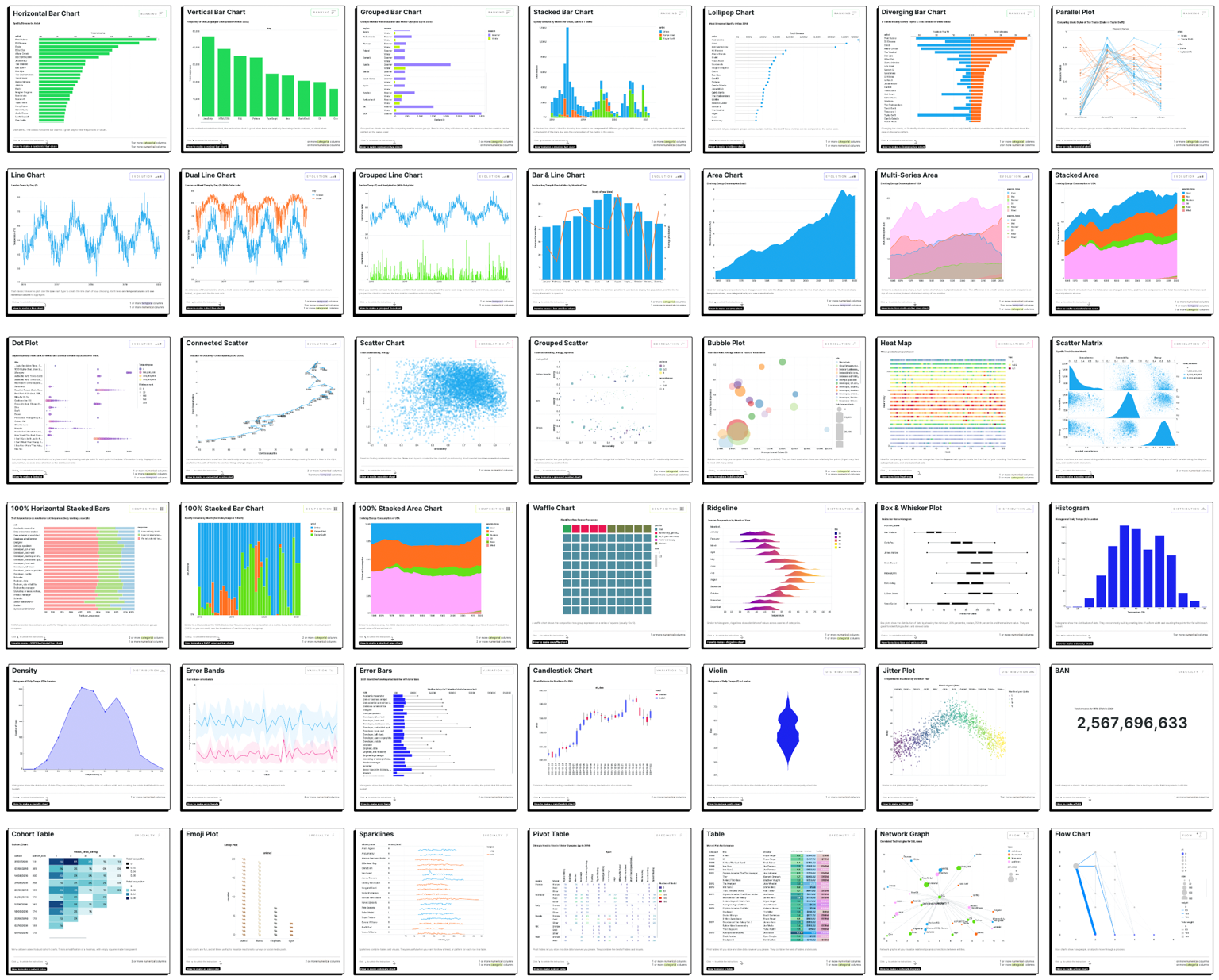
- Templated visuals << the quickest way to start.
- Custom visuals << provides more options and flexibility.
Dynamic text is another method to present single live data values in the canvas. You can use it in text boxes, sticky notes, or shapes. This allows you to blend live data into your notes, titles or comments so whatever you write stays current.
If you would like to learn more about creating visualisations in Count, the following tutorial videos provide an overview:
Part 1: Getting started with visuals: Learn to create customizable data visualizations through visual cells, including charts, tables, and pivot tables, with data governance and formatting tips.
Part 2: Advanced visualizations: how to go beyond templates in Count. Switch to the Custom tab to layer marks, use facets/subplots, pivot measures, and add table calculations.
Last updated: 10/09/26