Pivot Table
Pivot tables summarise data into a grid, letting you arrange dimensions into rows and columns with measures aggregated into values.
They’re useful for breaking down data by multiple categories, spotting patterns, or comparing across groups.
#Template options
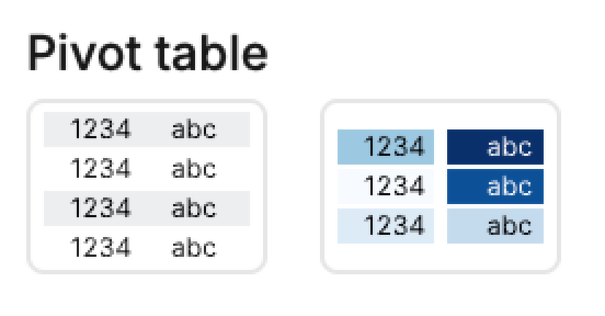
1. Basic pivot table → displays rows, columns, and aggregated values.
2. Pivot table with color → adds conditional formatting to highlight differences or ranges in the data.

#Mapping options
• Rows → Dimension(s) to group along the vertical axis. Multiple fields can also be added here, with order controlling the hierarchy.
• Cols → Dimension(s) to group along the horizontal axis. Multiple fields can also be added here, with order controlling the hierarchy.
• Values → Measures to aggregate (sum, count, average, etc.).
• Color → Applies conditional formatting to values.
#Pivot table versus table
#Pivot Visual
• Great for summarising data
• Easy grouping across rows/columns
• Less flexible around sorting/filtering
• Cannot export pivots in their pivot format
#Table Cell
• Great for quickly visualising your data
• Easy sorting and filtering
• Can work with aggregated data from the SQL cell
• Good for exporting the CSV in the same format
#Troubleshoot
#Sorting the pivot table
If you have created a Pivot Table to display your data, but when you try to sort your data by column it doesn't appear to work as you expected, it may be that a standard table is more suitable for your use case. This video explains the difference between these two formats.
Embedded Content
Embedded content: https://www.loom.com/embed/dba6eb015e5843d48c987ae3acdfd14c
#Adding colour scale to one column
- Switch to Custom tab for your pivot table
- Change Marks -> Type from Automatic to Square
- Add your column to apply the scale to into Color and Label
- In Color, navigate to Display and alter the color palette as preferred
- To add additional columns with a color scale, add/duplicate your Mark, move the x-axis Subplot setting up by 1 (this determines it's position), and modify the Label and Color field to your new data point, editing the scale palette as earlier outlined.
Embedded Content
Embedded content: https://www.loom.com/embed/8fdb8f4380ed4177b744d6a41a8d3bd2
#Adding row totals
- Switch to Custom tab for your pivot table
- Move your row facet field to the y-value channel
- Add the Measure Values into Text
- Duplicate the Text Mark (to create another Mark)
- Change your y-value to Measure Names - this will add a summary in.
Last updated: 03/08/26